Tous
← Back to Squawk list


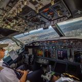
The New Air Canada Colors
Now in Ask the Pilot: The New Air Canada. Finally, a livery to love! "...The raccoon-face windscreen is both roguish flourish and a throwback to the liveries of old, when cockpit windows were often masked in black to reduce sun glare. All together, it's a proud design that says one thing and says it beautifully: Air Canada. That might seem redundant, but the trend in liveries over the past fifteen years, relying on hoary "in motion" themes and overly tangled motifs, has left… (www.askthepilot.com) Plus d'info...Sort type: [Top] [Newest]
I think it was the same design team that came up with that new 'City of VANCOUVER' logo! I wonder if Air Canada spent thousands of $ on this design! Lol!
Wow, sure are a lot of Grumpy Gus's here, while there are a few aspects of the design I would change like putting the forward maple leaf up top next to "Air Canada" overall it's a classy design. Have to agree with Mr Smith on wanting return of the window-level cheat line too.
Agree, a Delta look, not a WOW factor here. Maybe they should dump the maple leaf and go for a hockey stick and puck
boring
why is this such a big deal? every airline after a few years ,or a few changes,or a few mergers, or even the purchase of new aircraft,changes their livery either in a major way or in a subtle way..usually its in conjunction with a new ad campaign and a new slogan or motto as well..this "new" air Canada paint job for its aircraft is simple and elegant..when american changed from the basic silver with red white and blue and the aa eagle to its current livery,that was a major change and they even got the employees involved in a contest to help choose it..
Very poor livery design chosen